Want to know the secret to keeping visitors on your website and turning them into loyal customers? It all comes down to providing an excellent website user experience!
As someone who has spent nearly a decade analyzing and improving websites for businesses of all sizes, I can tell you that user experience can make or break your online success. I’ve seen websites transform from confusing mazes into user-friendly platforms that visitors actually enjoy using – and I’m here to help you achieve the same results.
In this article, I’ll walk you through the essential elements of creating an amazing website user experience. I’ll break down exactly what works (and what definitely doesn’t), share real-world examples, and give you practical tips you can start using right away.
Let’s dive in!
How To Provide a Good Website User Experience
Creating a good user experience on your website isn’t just a nice-to-have – it’s absolutely essential.
Think about it: when was the last time you stayed on a website that was slow, confusing, or hard to navigate? Probably never! And guess what? Your visitors feel the same way.
In my years of working with websites, I’ve noticed that the most successful ones all have one thing in common: they put their users first. It’s really that simple. When you provide a good user experience, visitors stick around longer, engage more with your content, and are more likely to become loyal customers.
But here’s the thing – many website owners make the mistake of designing their sites based on what they think looks cool, rather than what actually works for their users. I get it – we all want our websites to look impressive. But if your visitors can’t figure out how to use it, all that fancy design won’t matter much.
That’s why I’ve put together my top 12 tips for creating an outstanding website user experience:
- Ask Your Visitors
- Optimize Your Page Speed
- Be Error Free
- Master Navigation
- Use Pleasent White Space
- Include Engaging Visuals
- Break up Text
- Master Readability
- Have Clear Calls to Action
- Keep it Simple
- Be Consistent
- Be Responsive and Mobile-Friendly
1. Ask Your Visitors
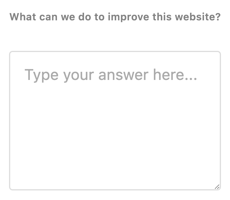
Here’s something that might sound obvious, but you’d be surprised how many website owners overlook it: just ask your visitors what they think! In my experience, the simplest solutions are often the most effective, and there’s no better way to improve website user experience than getting feedback directly from the people who matter most – your visitors.
Running surveys on your website can help you:
- Make improvements that actually matter to your users
- Build stronger relationships with your customers
- Save time and money by focusing on changes that will make a real difference
- Identify pain points you might have missed
- Understand what features your visitors value most
- Get fresh ideas for new content or features
- Measure satisfaction with recent changes
- Catch problems before they affect too many users
I’ve found that many businesses waste resources making changes they think their visitors want when they could just ask them directly.
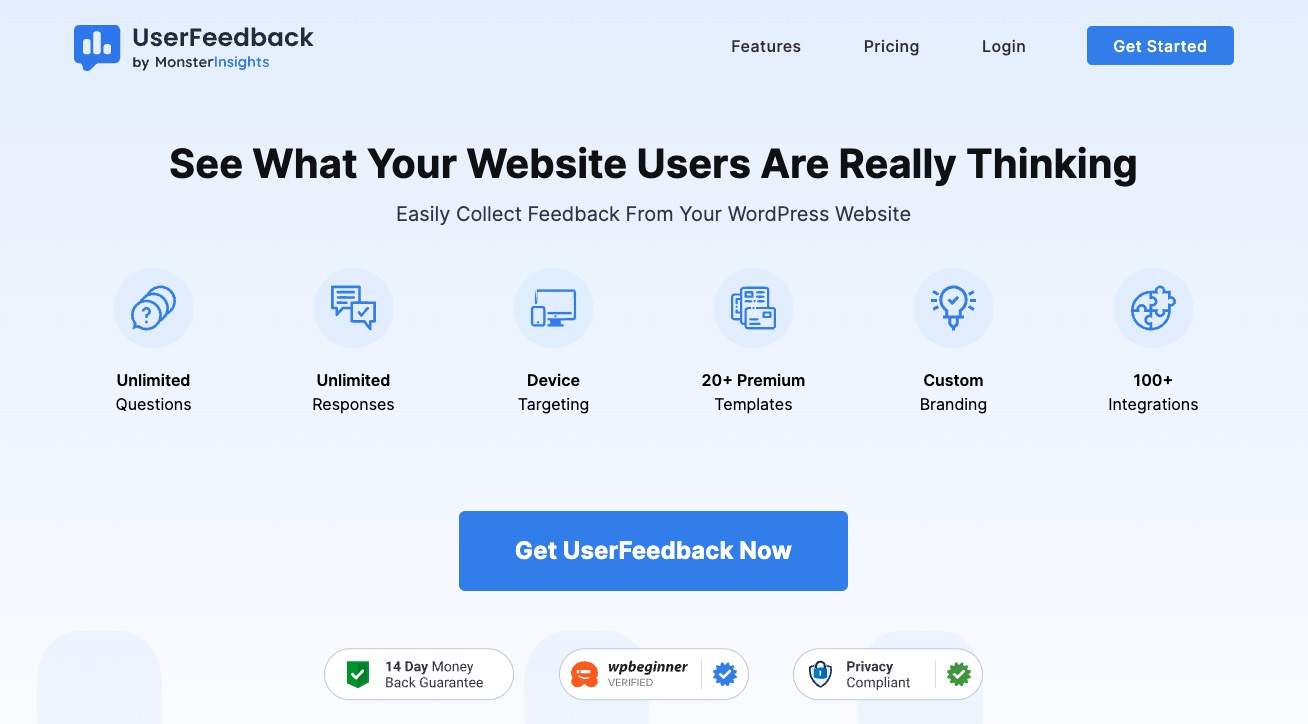
One tool I personally love and recommend is UserFeedback. It’s a super simple WordPress survey plugin that lets you create and manage surveys without any technical knowledge. You can set up surveys in minutes, target them to specific visitors, and even customize how they look to match your website’s style.
The best part? It integrates with Google Analytics, so you can track and analyze all your feedback in one place.
But remember, the key isn’t just collecting feedback – it’s acting on it. When visitors see that you’re actually listening and making changes based on their input, they’re more likely to stick around and keep engaging with your site.
Read our User Experience Survey (UX) Guide: Best Questions & Tips.
2. Optimize Your Page Speed
Let me tell you something – nobody (and I mean nobody) has ever said “I love waiting for websites to load!” And here’s the kicker: not only does a slow website frustrate your visitors, but it also makes Google think twice about ranking your site well.
Here’s what I’ve found works best to speed up your site:
- Compress your images (this is usually the #1 culprit of slow sites)
- Enable browser caching
- Clean up unnecessary code
- Use a reliable hosting provider (don’t just go for the cheapest option!)
For my WordPress users out there, I highly recommend using a good caching plugin. Another tool I recommend is MonsterInsights, which can help you keep an eye on your site speed right from your WordPress dashboard. It’s super simple to use and gives you actionable tips to make your site faster.
Not on WordPress? No problem! I always tell people to start with Google’s PageSpeed Insights tool. Just pop in your URL, and it’ll show you exactly what’s slowing down your site.
Quick tip: Don’t wait until your site is crawling to take action. Regular speed checks should be part of your website maintenance routine.
3. Be Error Free
Nothing ruins a website user experience faster than clicking a link and landing on a dreaded 404 error page! In my experience, keeping your website error-free is like maintaining good hygiene – it should be a basic part of your routine.
Here’s what typically causes these annoying errors:
- Moving content to a new location
- Deleting old pages without redirecting them
- Simple typos in your links
- Switching to a new domain
- Restructuring your website
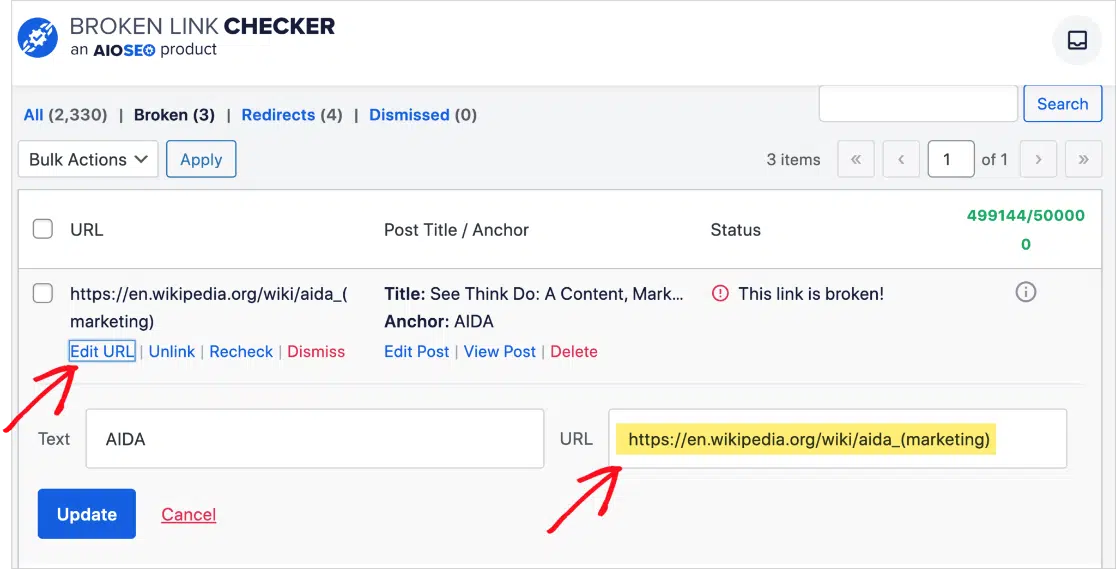
I always recommend setting up Google Analytics to track down these 404 errors. For WordPress users, I suggest using the Broken Link Checker plugin by AIOSEO. I love how it makes finding and fixing broken links as easy as checking off items on a shopping list. When you do find broken links, setting up 301 redirects is your best friend:
4. Master Navigation
I’ve noticed that even beautiful sites can fail if visitors can’t find their way around. Good navigation is absolutely crucial for creating a positive website user experience.
Here’s what I’ve found works best:
- Create a Clear Menu Structure
- Keep your main menu simple and logical
- Use familiar terms (avoid trying to be too clever!)
- Limit your main menu items (I recommend 5-7 max)
- Make sure your menu works well on mobile devices
Design an Effective Footer
- Include quick links to important pages
- Add contact information
- Feature your most popular content
- Include social media links
- Add a search bar for easy access
Build a Strong Internal Linking Structure
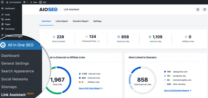
This is where many website owners drop the ball, but it’s super important! Think of internal links as friendly signposts guiding visitors through your content. They help people discover more of your valuable content and keep them engaged longer.
Here’s a pro tip for WordPress users: I absolutely love using AIOSEO’s Link Assistant feature. It’s like having a smart assistant that helps you find opportunities for internal linking and even spots those lonely “orphaned” pages that need more connections. The best part? You can add these links with just one click!
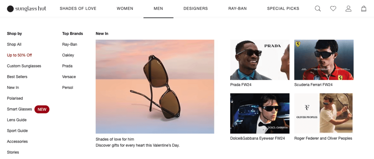
Here’s a great example of good user experience in terms of top menu navigation from Sunglass Hut:
5. Use Pleasent White Space
I’ve noticed a common misconception about white space – many think it’s wasted real estate that should be filled with content or ads. However, strategic use of white space is actually crucial for creating a good user experience and professional-looking design.
White space serves several important purposes:
- Improves content readability
- Helps visitors focus on key elements
- Creates a clean, professional appearance
- Reduces cognitive load
- Modernizes website design
Research from Wichita State University has shown that white space around text and titles can increase user attention by 20%. This makes it a powerful tool for emphasizing important content and improving engagement rates.
An important note: white space doesn’t literally have to be white. It can be any color that complements your brand’s design scheme. The key is creating breathing room between elements to prevent visual overcrowding.
The main challenge lies in finding the right balance, particularly in the above-the-fold area of your website. You’ll want to maintain visibility of important content while providing adequate spacing. Start with more white space than you think necessary, then adjust based on user feedback and engagement metrics.
Check out this great example of using white space on the Clay website:
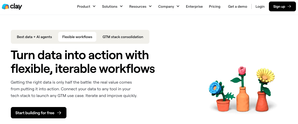
Do you see how every element is clear and pops out to the eye? That’s what you should aim for.
6. Include Engaging Visuals
Visual content is a crucial element in creating an effective website user experience. Strategic use of visuals can break up text content, increase engagement, and communicate key messages more effectively than text alone.
Here are the most effective types of visual content:
- Original photography of products, team, and workspace
- Custom infographics for complex information
- Branded graphics aligned with company identity
- Targeted video content
- Product demonstrations and screenshots
It’s important to avoid overusing stock photography. While these images may appear professional, they often reduce website credibility and can make your brand appear less authentic – Yikes!
Instead, invest in original visual content. Modern smartphones can capture high-quality images of your actual business operations, making authentic visual content more accessible than ever.
Key considerations for website visuals:
- Must serve a clear purpose
- Should align with content messaging
- Need to reinforce brand identity
- Must guide user attention effectively
- Should build trust with visitors
Technical optimization is equally important. Large image files can significantly impact page load times, affecting overall user experience.
Best practices include:
- Compressing images before upload
- Using appropriate file formats (JPG for photos, PNG for graphics)
- Implementing responsive image sizing
- Adding descriptive alt text
- Maintaining consistent image dimensions
Apple is an awesome example of how visuals can make your site stand out and look appealing:

7. Break up Text
Reading on a computer screen or on a phone is not like reading a book. What a shocker, right?
But it’s actually important to remember and I see a ton of people forgetting this point. Here are some guidelines for using proper header tags and providing a good user experience in terms of readability.
Headings Hierarchy
- H1: Use once per page for the main title
- H2: The main section breaks
- H3: Subsection organization
- H4: Detailed breakdowns when needed
Paragraph Formatting
- Keep paragraphs short (3-4 lines maximum)
- Use adequate spacing between paragraphs
- Limit line width (60-80 characters per line)
- Include white space margins
Content readability improves significantly when text is properly structured. Think of your content like a book – chapters, sections, and paragraphs make it digestible and easy to navigate. This same principle applies to website content.
Best Practices for Text Layout:
- Use bullet points for lists (like the one you’re reading now)
- Include relevant subheadings every 200-300 words
- Maintain consistent formatting throughout
- Ensure mobile-friendly text scaling
- Add a table of contents for longer content
Search engines also benefit from well-structured content, as they can better understand your page organization and content hierarchy. This dual benefit of improved user experience and SEO makes proper text formatting super important.
8. Master Readability
This goes hand in hand with the point above and it’s similar but different. Creating a good user experience means making your content easy to read. Even the best content becomes useless if visitors strain to read it.
These are my recommendations:
Font Size
- Use at least 16px for body text
- Make headings clearly larger
- Ensure text is readable on mobile
Color and Contrast
- High contrast between text and background
- Avoid light gray text
- Use dark colors for main text
- Consider color-blind visitors
Font Choices
- Stick to clear, simple fonts
- Use no more than 2-3 different fonts
- Make sure fonts work well on all devices
Spacing
- Give text room to breathe
- Use 1.5 line spacing
- Add space between paragraphs
- Include proper margins
Pro tip: Use a contrast checker tool to ensure your text is readable for everyone. If you’re unsure about your text design, ask someone else to read it on different devices – their feedback can be invaluable.
I agree with this point from WebfulCreations:

9. Have Clear Calls to Action
Your website needs to guide visitors toward taking action. Even the best website user experience falls flat without clear CTAs that tell people exactly what to do next.
Effective CTAs should:
- Stand out visually from other content
- Use action-oriented language
- Create a sense of urgency when appropriate
- Be placed in strategic locations
- Make the next step obvious
Color choice matters more than you might think. For example, blue CTAs often convey trust, while red can create excitement or urgency.
Here’s what works best:
- Use contrasting colors that pop
- Keep the text short and clear (“Start Free Trial” vs “Click here to begin your free trial today”)
- Make buttons large enough to be easily clickable
- Position CTAs where they make sense in the user journey
- Test different versions to see what works best
Pro tip: Don’t overwhelm visitors with too many CTAs on one page. Focus on one primary action you want them to take, and make that option crystal clear.
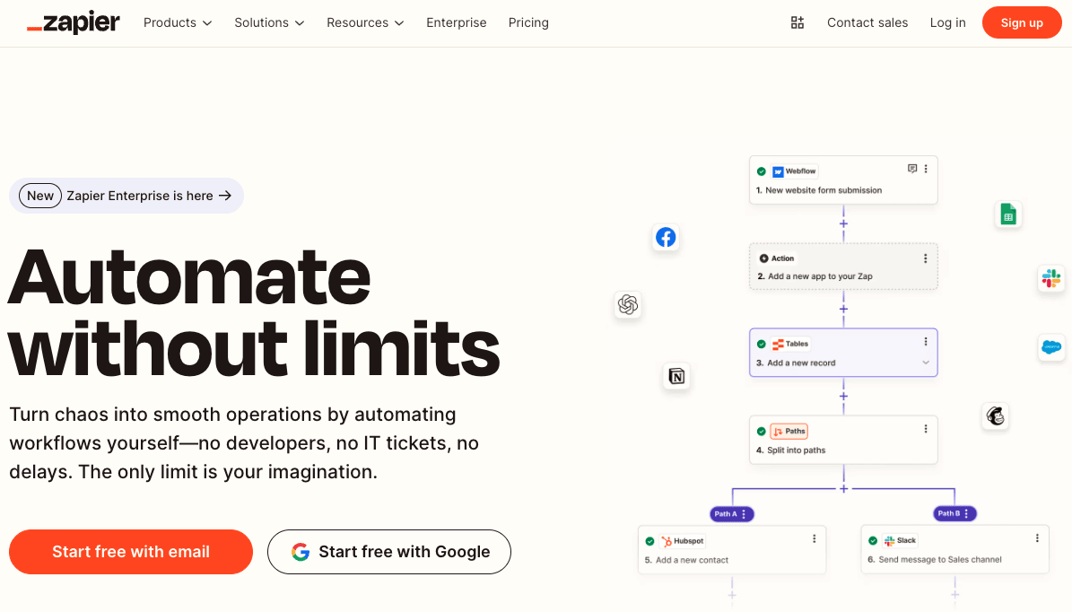
Check out the home page of Zapier. They do a great job at making their CTA’s pop:
10. Keep it Simple
For it comes to website user experience, less is usually more. I’ve seen too many websites try to cram everything above the fold, resulting in a cluttered mess that drives visitors away. Here’s what simplicity means in practice:
- Clean, uncluttered layouts
- Clear messaging without jargon
- Limited color palette (2-3 main colors)
- Focused content that serves a purpose
- Minimal animations and effects
Remember: Every element on your page should earn its place. If something doesn’t contribute to your site’s goals or help your visitors, it probably doesn’t need to be there.
11. Be Consistent
Consistency creates comfort and builds trust. Your website should feel like one cohesive experience, not a collection of random pages. This means maintaining:
- Uniform navigation placement
- Consistent color schemes
- Same font families throughout
- Similar image styles and treatments
- Matching button and link styles
- Coherent tone of voice in content
- Standardized spacing and layouts
Think of your website like a well-designed book – each page might have different content, but the overall style remains the same, making it easy to follow and understand. The worst would be if your users started doubting whether they were still on the same website!
12. Be Responsive and Mobile-Friendly
With over 58% of web browsing happening on phones in 2023, mobile optimization isn’t just a nice-to-have – it’s crucial for a good user experience. Here’s what to focus on:
- Ensure text is readable without zooming
- Make buttons and links large enough to tap
- Check that forms work well on small screens
- Optimize images for faster mobile loading
- Simplify menus for mobile navigation
- Test on various devices and screen sizes
- Consider thumb-friendly navigation zones
Pro tip: Don’t just make your site work on mobile – make it shine. Test every new feature on both desktop and mobile devices before launching. What looks perfect on your computer screen might need significant adjustments for smartphone users.
And that’s it!
I hope you liked my guide and tips on how to provide a great website user experience. If you liked it, maybe you’d also like to read:
Haven’t tried UserFeedback yet? Get started today!
And don’t forget to follow us on X and Facebook to learn more about online marketing and collecting user feedback.
