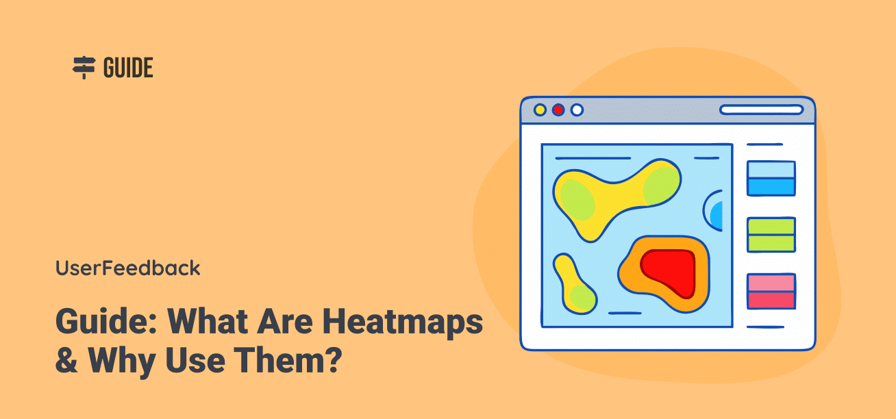
Heatmaps are powerful visual tools that reveal what users are doing on your website—where they click, how far they scroll, and which elements they look at or ignore. Heatmaps contain the answers if you’ve been struggling to understand why visitors aren’t converting or which parts of your site get the most attention.
In this guide, I’ll walk you through what heatmaps are, how they work, the different types available, and practical ways to use them to supercharge your website’s performance and user experience.
Let’s jump right in!
Table of Contents:
- What Are Heatmaps?
- What Are Heatmaps Used For?
- Different Types of Heatmaps
- Why Should You Use Heatmaps?
- How to Create a Heatmap
- Frequently Asked Questions
What Are Heatmaps?
A heatmap is a graphical representation of data where values are depicted by colors to display complex information in a way you can quickly understand.
Website heatmaps use a color spectrum to visualize user interactions, typically showing “hot” areas (high activity) in red or orange and “cold” areas (low activity) in blue or green.
The basic concept is simple: the warmer the color (red, orange, yellow), the more activity or engagement that area receives. The cooler the color (green, blue), the less activity it gets.
For example, a red spot on a click heatmap means many users clicked on that specific element, while a blue area indicates few or no clicks. This visual approach makes it much easier to identify patterns than looking at spreadsheets of numbers or raw analytics data.
Heatmaps work by collecting user interaction data from your website and then overlaying this information on a visual representation of your webpage. The result is a color-coded view that immediately shows which parts of your page attract the most attention and which parts users ignore.
What makes heatmaps particularly valuable is their ability to transform complex user behavior data into actionable insights without requiring advanced technical knowledge. Unlike traditional analytics that show what’s happening, heatmaps help you understand why it’s happening by revealing how users actually engage with your pages.
What Are Heatmaps Used For?
Heatmaps serve many practical purposes for website owners, marketers, UX designers, and developers. Here are the key ways businesses use heatmaps to improve their websites:
Identifying User Behavior Patterns
Heatmaps reveal how visitors actually interact with your website, highlighting which elements attract attention and which ones get ignored.
This information helps you understand if users are engaging with your site the way you intended.
Improving Conversion Rates
By showing exactly where users click (or don’t click), heatmaps help you identify why visitors might not be converting. Perhaps they’re not seeing your call-to-action button, or they’re clicking on non-clickable elements expecting something to happen.
This is great information and a very easy fix that instantly bumps up your conversion rates.
Optimizing Page Layout and Design
Heatmaps help determine the most effective placement for important content, CTAs, and images based on actual user behavior rather than assumptions.
For example, if most users don’t scroll past a certain point, you’ll know to place critical information above that threshold.
Enhancing User Experience
By identifying friction points where users struggle or get confused, heatmaps enable you to create a more intuitive and user-friendly website. This might involve fixing navigation issues, making clickable elements more obvious, or removing distracting content.
Testing Website Changes
Before and after implementing changes to your website, you can use heatmaps to see how these modifications impact user behavior. This provides concrete evidence of whether your changes improved engagement or had unintended consequences.
Prioritizing Website Updates
With limited time and resources, it’s important to focus on changes that will have the biggest impact. Heatmaps help you identify which issues are actually affecting user behavior, allowing you to prioritize the most critical stuff first.
Supporting A/B Testing
When running A/B tests, heatmaps provide valuable context about why one version might be performing better than another by showing differences in how users interact with each variation.
What makes heatmaps particularly valuable is their ability to answer critical business questions like “Why aren’t users converting?” or “How can I get more visitors to take action?” with visual evidence rather than guesswork or assumptions.
Now, lets explore some different types of heatmaps you can use for your business.
Different Types of Heatmaps
There are several types of heatmaps, each designed to capture different aspects of user behavior on your website. Understanding these different types helps you select the right tool for answering your specific questions about user experience.
Scroll Maps
First, let’s explore scroll maps.
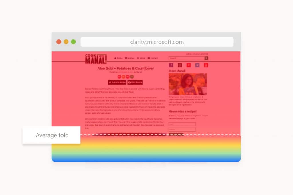
Scroll maps show exactly how far down the page your visitors scroll, revealing which content gets seen and which gets missed.
They use a color gradient to indicate viewing percentages – red areas have high visibility (viewed by most visitors), while blue areas have low visibility (seen by few visitors).
Scroll maps help you understand:
- Where the average fold line is (the point where users need to scroll to see more)
- Which content areas receive the most attention
- Whether important elements like CTAs or key information are being seen
- If users are reaching the bottom of your pages
Pro Tip: If you notice users aren’t scrolling to important content, consider moving critical elements higher on the page or creating more compelling above-the-fold content that encourages scrolling.
Move Maps
Move maps (also called hover maps or mouse tracking maps) track where users move their cursor as they navigate your site. Research suggests a correlation between cursor position and eye movement – where people move their mouse often indicates where they’re looking.
Move maps help you:
- Identify which elements draw visual attention
- See which content users are reading (as people often trace text with their cursor)
- Understand the “reading patterns” of your visitors
- Spot areas of interest that might not generate clicks
These maps provide insights into user curiosity and attention beyond what click data alone can show.
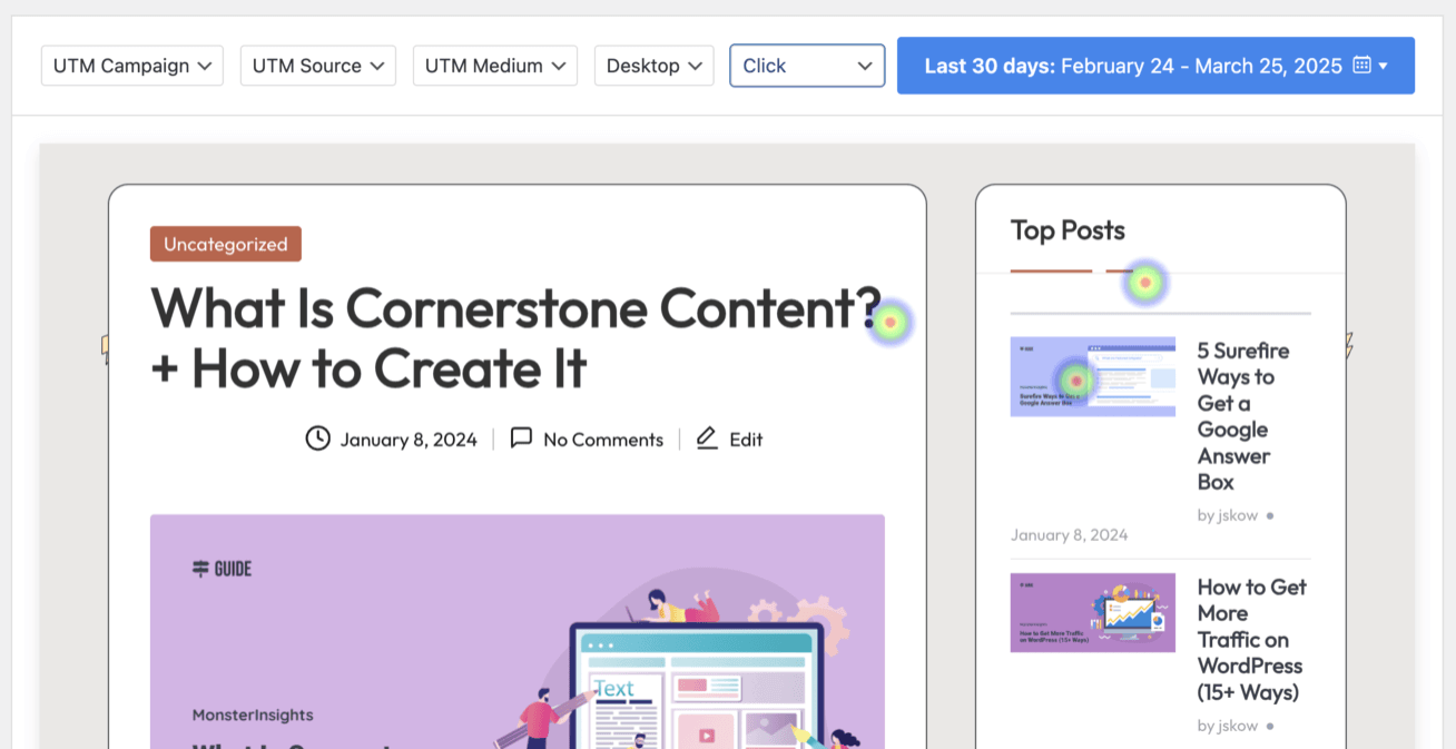
Click Maps
Click maps (or touch heatmaps on mobile devices) show exactly where users click or tap on your website. They’re among the most actionable heatmaps because they reveal direct user interactions with your page elements.
Click maps help you discover:
- Which buttons, links, and CTAs get the most interaction
- Whether users are trying to click on non-clickable elements (like images or text)
- Which navigation items are most popular
- Which parts of forms or interactive elements users engage with most
This data helps you prioritize content and ensure the most important elements receive proper attention and placement.
Here is what a click map looks like using UserFeedback:
Attention Heatmaps
Attention heatmaps combine data from various user interactions to create a comprehensive view of engagement. They analyze click data, scroll behavior, mouse movements, and time spent to show which page areas receive the most overall attention.
These maps help you:
- Get a complete picture of user engagement
- Identify your content’s most valuable real estate
- Compare overall engagement between different page sections
- Make strategic decisions about content organization
Many heatmap tools now offer “engagement zones” that break down the page into a grid, showing relative engagement levels for each section at a glance.
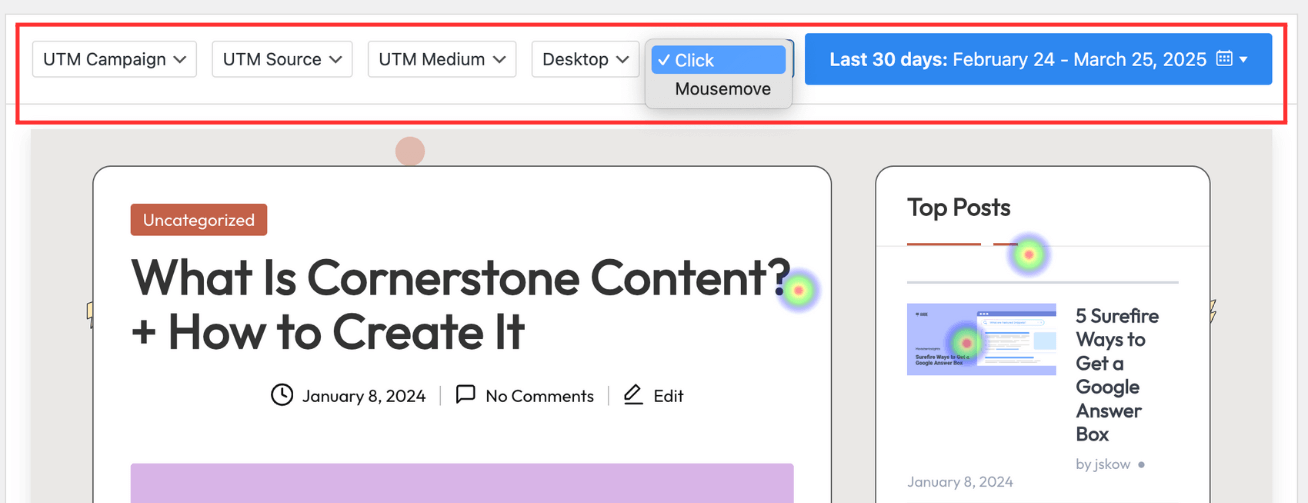
Device Maps (Desktop, Tablet, Mobile)
Device-specific heatmaps show how user behavior differs across device types. With mobile accounting for over 50% of web traffic, understanding these differences is critical for optimizing the user experience.
Device maps reveal:
- How the same page performs across different screen sizes
- Whether important elements are visible on smaller screens
- If mobile users interact differently than desktop users
- Which device types show the best engagement or conversion rates
For example, content that appears above the fold on desktop might require significant scrolling on mobile, dramatically affecting its visibility and effectiveness.
That’s why we at UserFeedback provide the option to break down heatmaps based on devices:
Get started with UserFeedback today!
Each type of heatmap provides unique insights into user behavior. By using them together, you can build a complete picture of how visitors interact with your website, allowing you to make informed decisions about design, content, and optimization.
Why Should You Use Heatmaps?
Heatmaps transform abstract user data into actionable insights that can directly impact your bottom line. If you’re looking to grow your business, here are compelling reasons to start using heatmaps today:
1. Understand What Your Users Really Do
The gap between what we think users do and what they actually do is often surprisingly wide. Heatmaps bridge this gap by showing real behavior rather than assumptions. This helps you:
- See if users notice important elements like CTAs and offers
- Discover if visitors are getting distracted by non-essential content
- Identify if users are attempting to click on non-clickable elements
- Understand how far down your page most visitors actually scroll
2. Make Data-Driven Design Decisions
Rather than relying on gut feelings or personal preferences, heatmaps provide concrete evidence to inform your website changes:
- Know exactly where to place important content for maximum visibility
- Identify which elements to emphasize and which to downplay
- Determine optimal positioning for CTAs based on actual user attention
- Validate or challenge assumptions about your current design
3. Increase Conversion Rates
One of the most valuable benefits of heatmaps is their ability to highlight opportunities for conversion optimization:
- Spot underperforming CTAs that need repositioning or redesigning
- Identify distractions that pull attention away from conversion elements
- Discover if users are abandoning forms at specific fields
- See if your pricing table or product information gets proper attention
4. Fix Usability Issues Quickly
Heatmaps excel at revealing usability problems that might otherwise go unnoticed:
- Identify confusing elements that receive excessive clicks but don’t function
- Discover navigation paths that users attempt but can’t complete
- Find content that’s being ignored despite its importance
- Detect if mobile users face different challenges than desktop users
6. Improve Content Strategy
Content creation requires significant investment—heatmaps help ensure it delivers results:
- See which content sections engage readers the most
- Identify where readers typically stop engaging
- Understand how images and media affect surrounding content engagement
- Discover which topics or formats generate the most interaction
7. Support A/B Testing Efforts
While A/B tests tell you which version performs better, heatmaps reveal why:
- Understand the specific interaction differences between variations
- Identify which elements drive the performance difference
- Gain insights for further testing and optimization
- Get context for unexpected test results
As you can see, there are a ton of great reasons why you should use heatmaps. They bring powerful insights that you can use to grow your business much more precisely.
Let’s take a look at the best solutions for creating and using heatmaps.
How to Create a Heatmap
Creating a heatmap is surprisingly simple with today’s tools. Several excellent options are available depending on your needs and platform:
For WordPress Users: UserFeedback
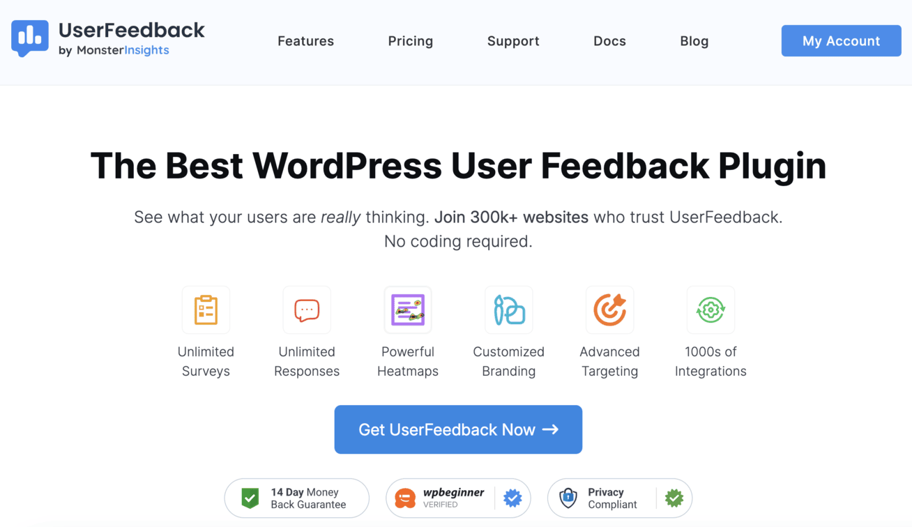
If you’re running a WordPress site, UserFeedback is the best solution. It offers a powerful and user-friendly heatmap solution that you can combine with feedback collection through surveys.
It’s a great combination for understanding both what users are doing and why they’re doing it that integrates seamlessly with your existing setup:
- Simple installation through the UserFeedback plugin
- No coding required—just install the Heatmaps addon and select the pages you want to track
- Automatic data collection and visualization
- Filter options for clicks, mouse movements, devices, and date ranges
- Campaign tracking features to segment heatmap data by traffic source
Read more in our latest announcement: Introducing Powerful Heatmaps with UserFeedback 1.5
Besides the powerful heatmap feature, UserFeedback is also the best choice for running surveys on Wordpress. It offers:
- Unlimited surveys and questions
- Various question types
- Pre-made survey templates (for common surveys like NPS, CSAT, and CES)
- Conditional logic and redirect features
- Advanced targeting options
- Customizable designs
- AI feedback analysis feature
- Integration with Google Analytics for easy data analysis
- And much more
UserFeedback is the ultimate solution for WordPress site owners who want to have comprehensive visitor insights through a seamless combination of behavioral analytics and direct user feedback. All while maintaining the simplicity and integration benefits of a native WordPress plugin.
Get started with UserFeedback now!
Microsoft Clarity

Microsoft Clarity is a free heatmap and session recording tool that works on any website platform:
- Free to use with unlimited websites
- Easy setup with a simple tracking code
- Includes session recordings alongside heatmaps
- Offers scroll maps, click maps, and area maps
- Provides insights on rage clicks and excessive scrolling
Other Popular Options
Besides those 2, there are many excellent heatmap solutions to fit different needs:
- Hotjar: Combines heatmaps with recordings and feedback tools
- Crazy Egg: Focuses on heatmaps with A/B testing capabilities
- Lucky Orange: Offers real-time heatmaps alongside chat features
- Mouseflow: Provides detailed heatmaps with form analytics
Frequently Asked Questions
When should you use a heatmap?
Use heatmaps when you want to understand how users interact with your website, identify usability issues, or optimize conversion rates. They’re particularly valuable after launching a new page, when conversions drop unexpectedly, or before redesigning your site to establish baseline metrics.
How do you interpret a heatmap?
Look for patterns in color intensity—red areas show high engagement, while blue indicates low activity. Pay attention to unexpected click patterns, content that’s being ignored, and how far users scroll. Compare desktop and mobile heatmaps to spot device-specific issues.
How do heatmaps work?
Heatmaps work by tracking user interactions like clicks, mouse movements, and scrolling behavior on your website. This data is collected via JavaScript code and visualized as a color overlay on your page, with warmer colors (red/orange) showing high activity and cooler colors (blue/green) showing low activity.
And that’s it!
I hope you enjoyed this comprehensive guide on what heatmaps are and why you should be using them. Maybe you’d also like to check out:
- The Ultimate Guide to Website Feedback
- 12 Proven Ways to Increase Your Survey Response Rate
- 10 Online Survey Examples to Get You Started
Don’t forget to follow us on X and Facebook to learn more about online surveys and collecting customer feedback.